Graduation is over :). Real world here I come. Anyway, going to be moving in probably a month or so. In the meantime I’ve got a lot more time to focus on some of my game projects. My main focus is finishing up an iphone game and it’s coming along great! Whenever I play it I end up playing it for a lot longer than needed for testing, so hopefully that’s a good thing :). I’m still iterating on the gameplay and the aesthetics for it using placeholders and crappy programmer art. The current build in still shots looks like a ‘mess’ more or less. Won’t make for good app store screens looking like it is now because it’s too confusing. The very first version was very easy to distinguish the player from enemies because it simply had 3 colors (black, red, white). I may have to use that principle moving forward to help keep the confusion to a minimum.
The game is a tilt-controlled shoot-em up. Except the player cannot shoot directly :). So during the game the player only tilts the iPhone and never touches the screen. Two big wins here:
- Intuitive controls
- No fingers getting in the way of the screen.
In order to destroy enemies the player must run into power ups. When they hit one it sets off an explosion affecting an area around the power up. The basic one simply kills enemies in the blast radius, while others have more interesting effects.
So here’s a few screenshots of the game from very beginning to the current ‘messy’ build.
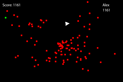
The above screen shows the very first prototype. Green boxes were pick ups. People that played it enjoyed it despite the really simplistic look.
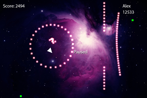
The next iteration had some basic placeholder graphics and a static background placeholder image. The gameplay also introduced pre-configured wave shapes for enemies to spawn in. So in addition to random spawning enemies could try to attack in lines, surround you in a circle, etc. It upped the difficulty a bit so some tweaking was needed.
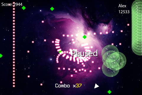
This next iteration was focused on gameplay improvements and additions. I added a new power up (a type of explosion that spread from enemy to enemy), and a combo system along with a few other things. The new power up was added to counter-act the difficult spawning patterns of the enemies and it proved useful. It was almost too useful.
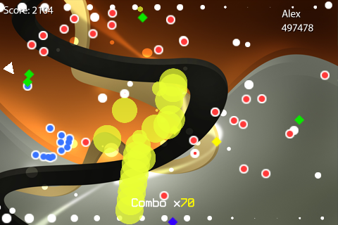
And that brings us to the current build. I redid a lot of the graphics and went for a simple vector-art look. Unfortunately, the overall look tends to be very messy in screenshots and the color scheme is ‘meh’. Though I like the look of the enemies, the explosions (particularly the redone viral spreading explosion) could use some work. The blue enemies are enemies that were hit with a freeze power up. There were a few more power ups added. In general, the game feels more solid but visually feels less focused.
Those that are wondering where I got the placeholder background images from:
I do not intend to use them in the final game as they will be replace by original artwork.
I’ll have more on the game’s features in the coming weeks as things start to finalize.